Cloudstyle is Google Cloud’s design system.
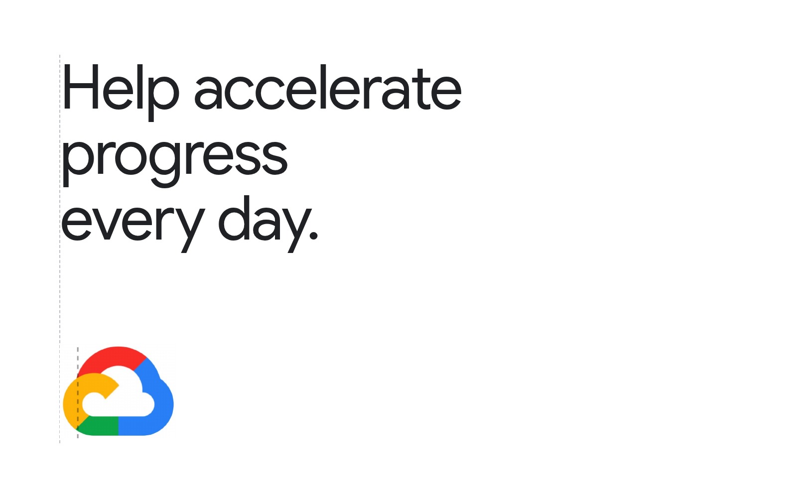
Our goal was to align its visual language with the brand strategy, Help Accelerate Progress Every Day. “Progress” showed up across every touchpoint while staying true to the core of the Google brand, and gave product, marketing and sales one way to tell the cloud story instead of three.
Mandate Bring Cloudstyle, Google Cloud’s design system, in line with the Progress strategy without breaking from the core Google brand.
Led Direction for the refresh, the campaign and the co-brand systems, with the in-house team and VSA Partners; the Super Cloud and Progress Bar decisions and the rules that govern them.
What changed Product, marketing and sales got one way to tell the cloud story instead of three, in a system they could adopt rather than reinterpret.
Role: Design Lead
Scope: Cloudstyle refresh, brand campaign, co-brand systems
With: In-house team · VSA Partners
Launch film
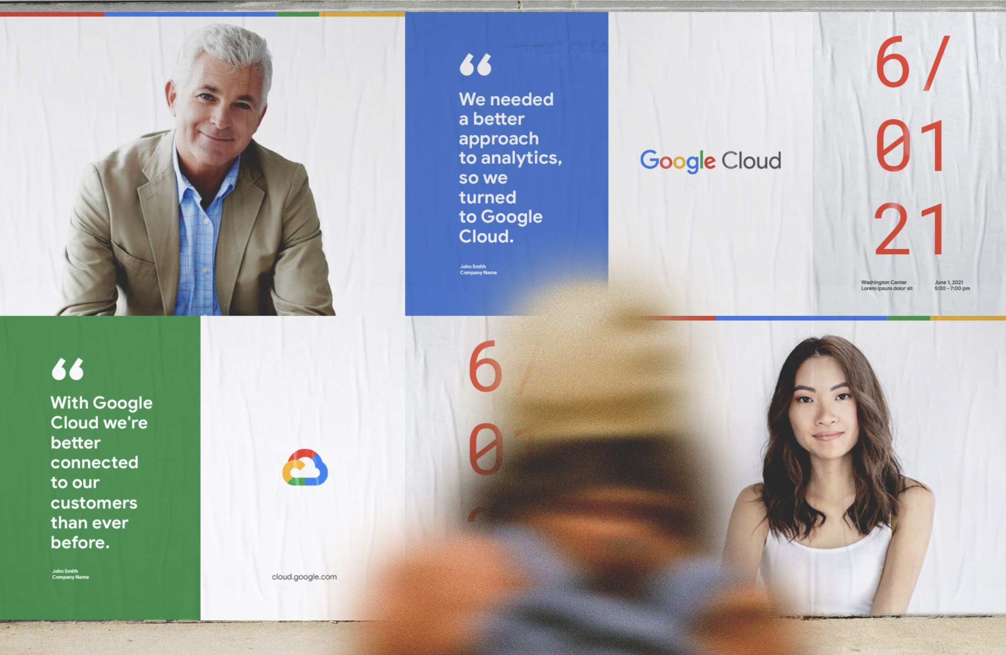
Campaign
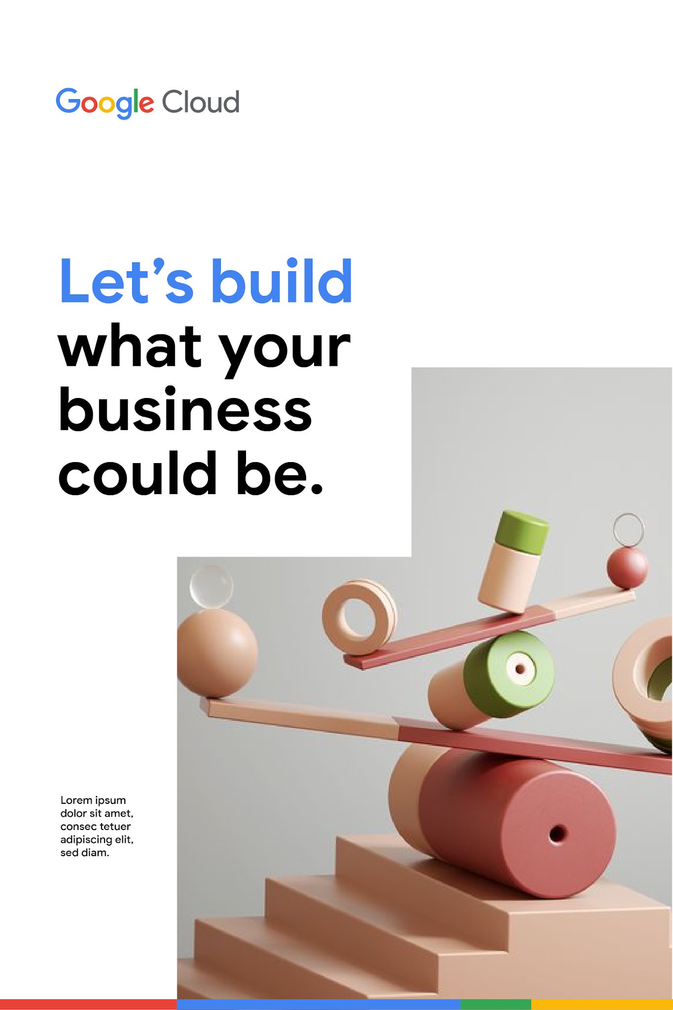
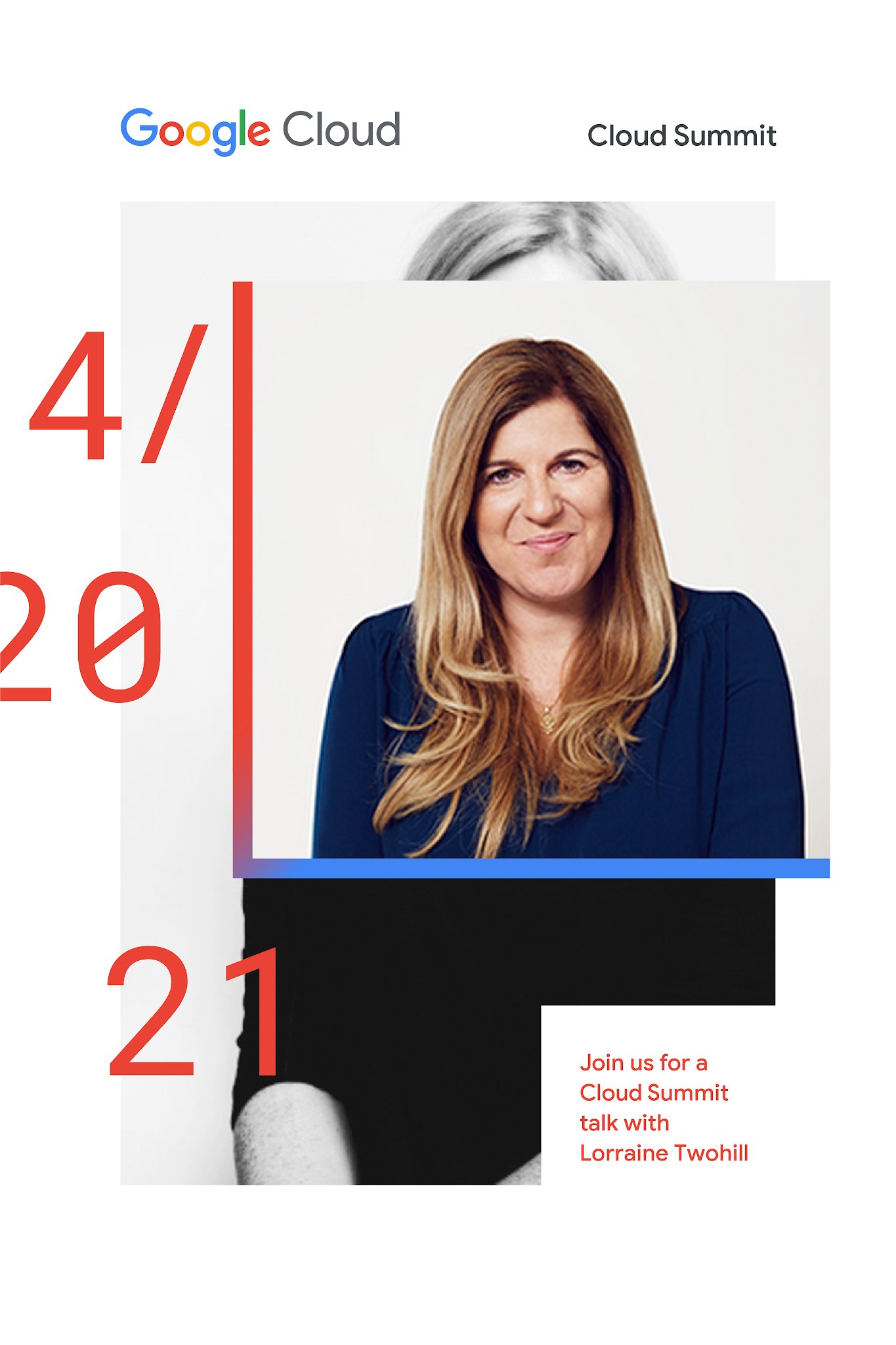
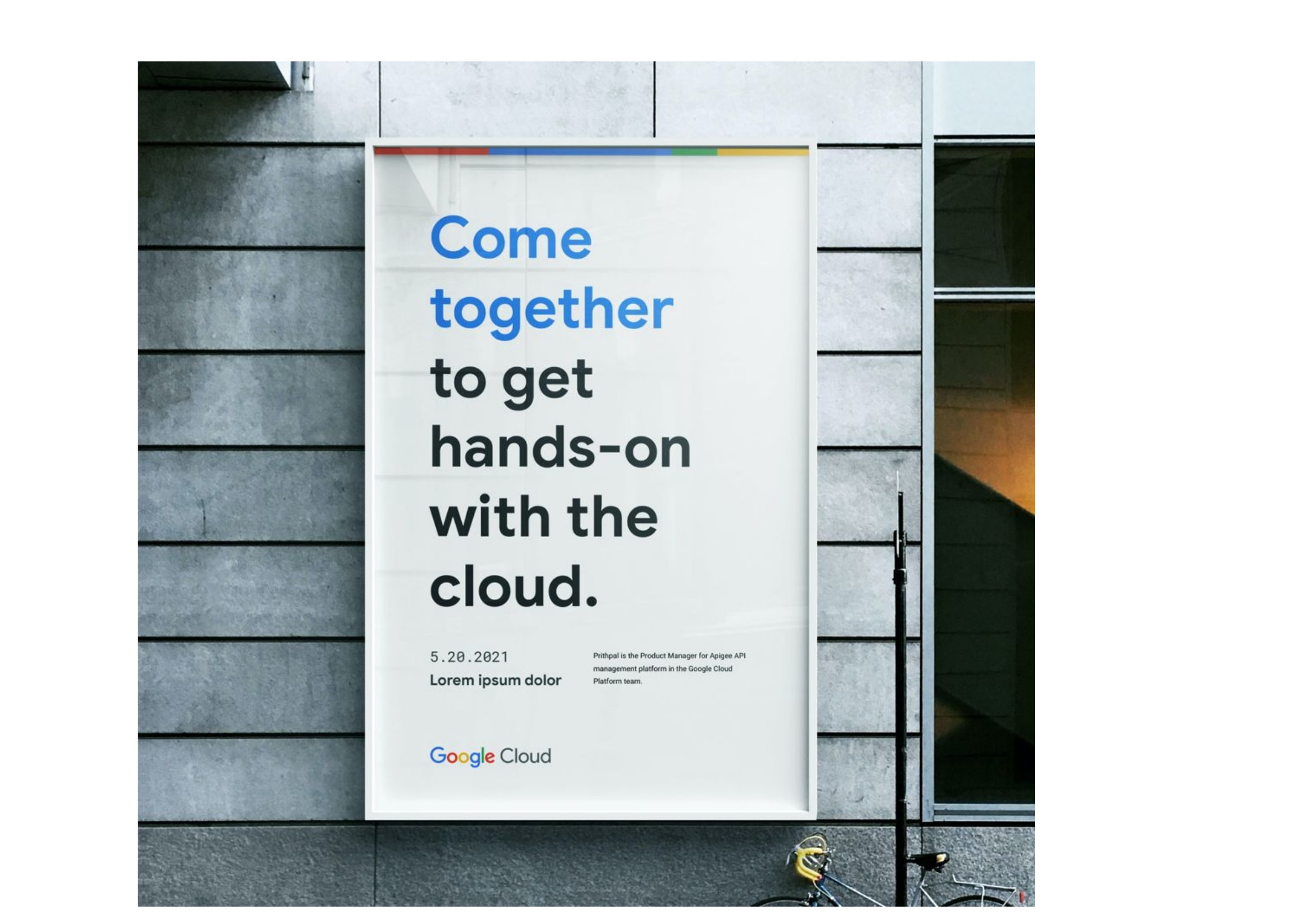
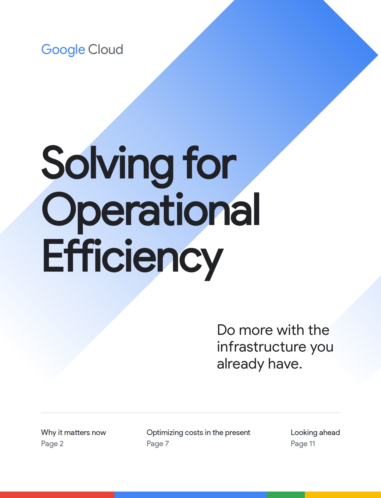
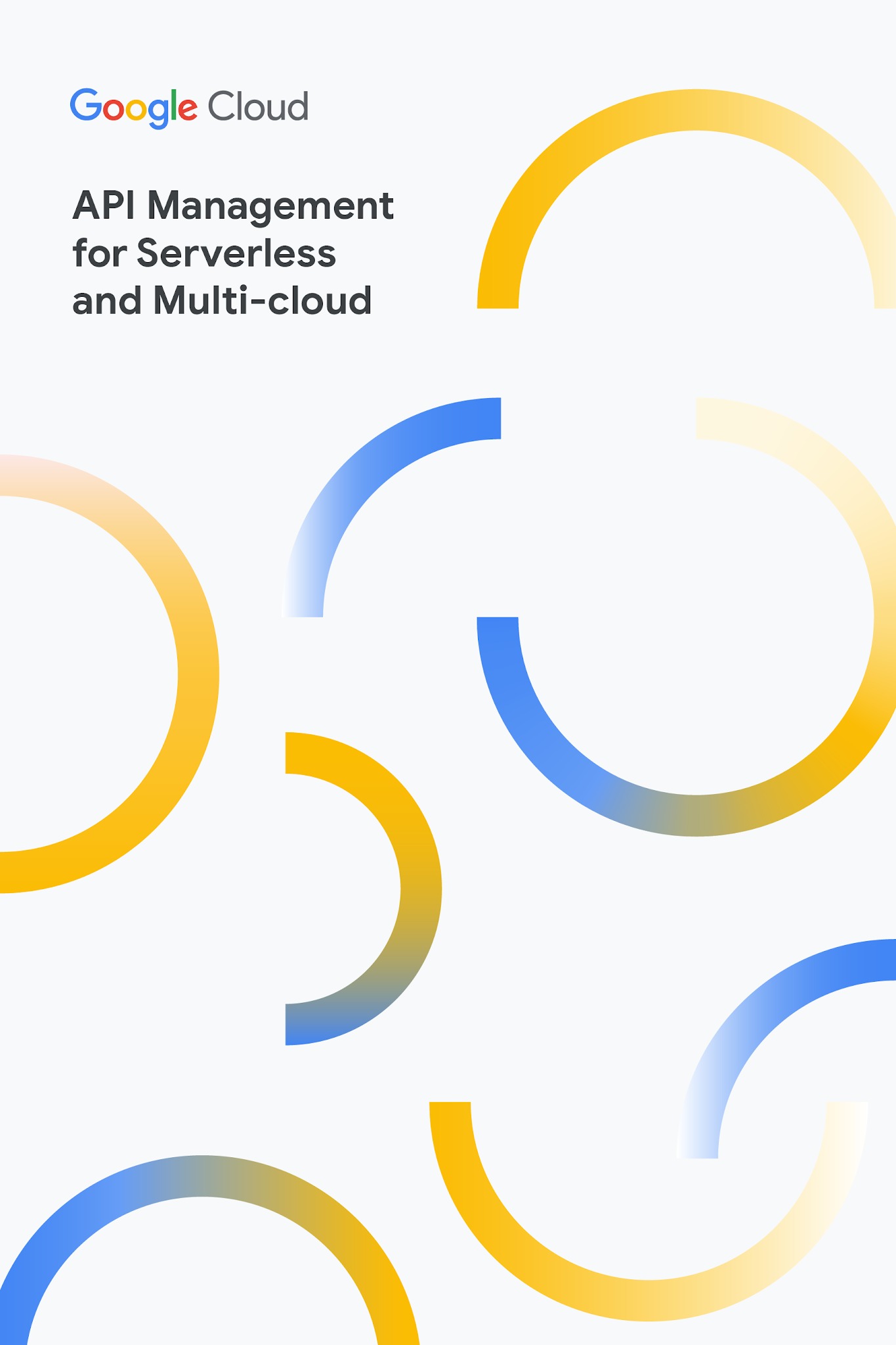
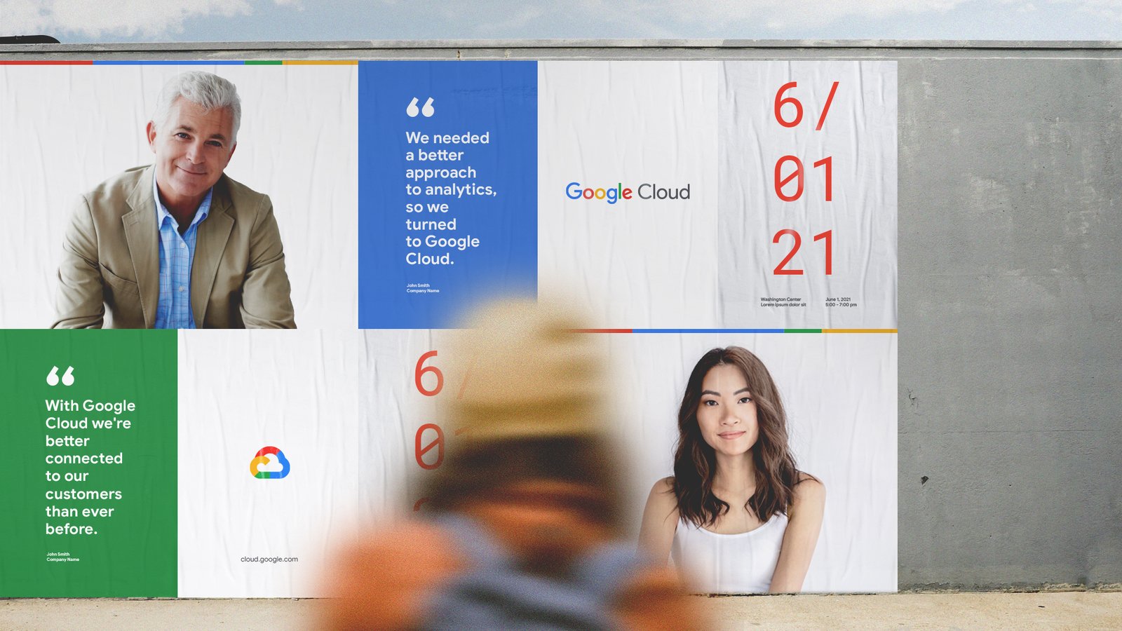
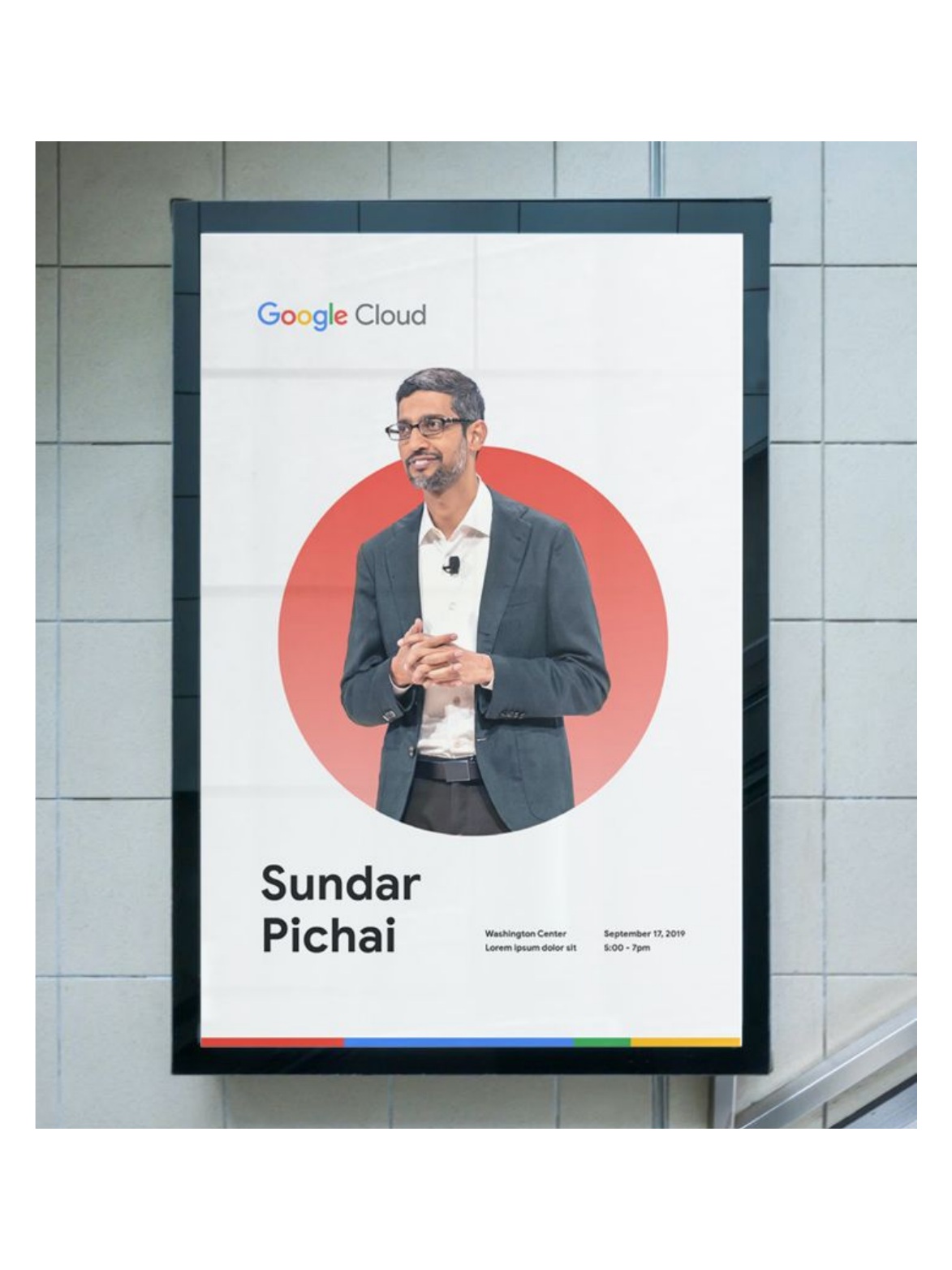
Out of home
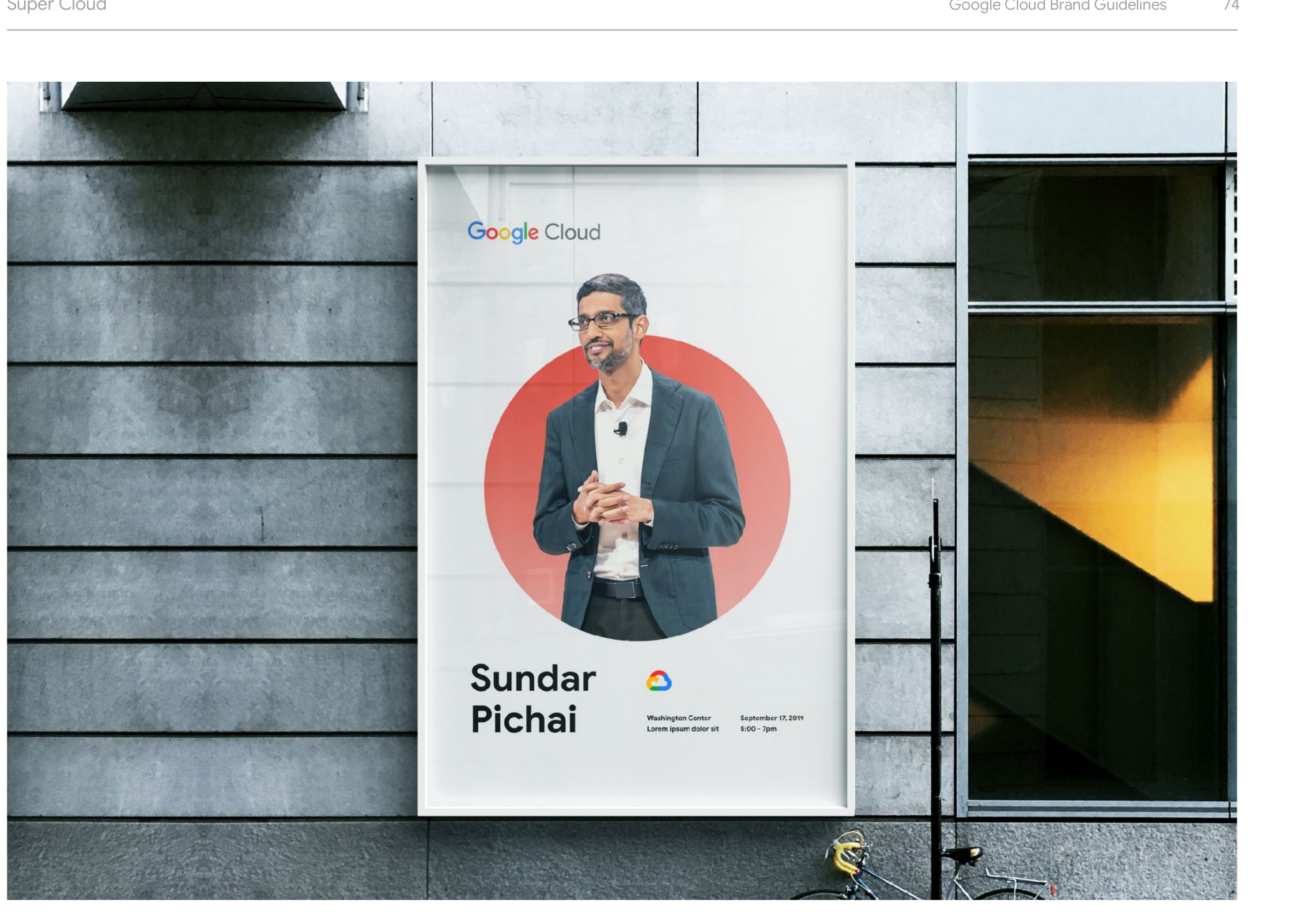
The Super Cloud and the Progress Bar
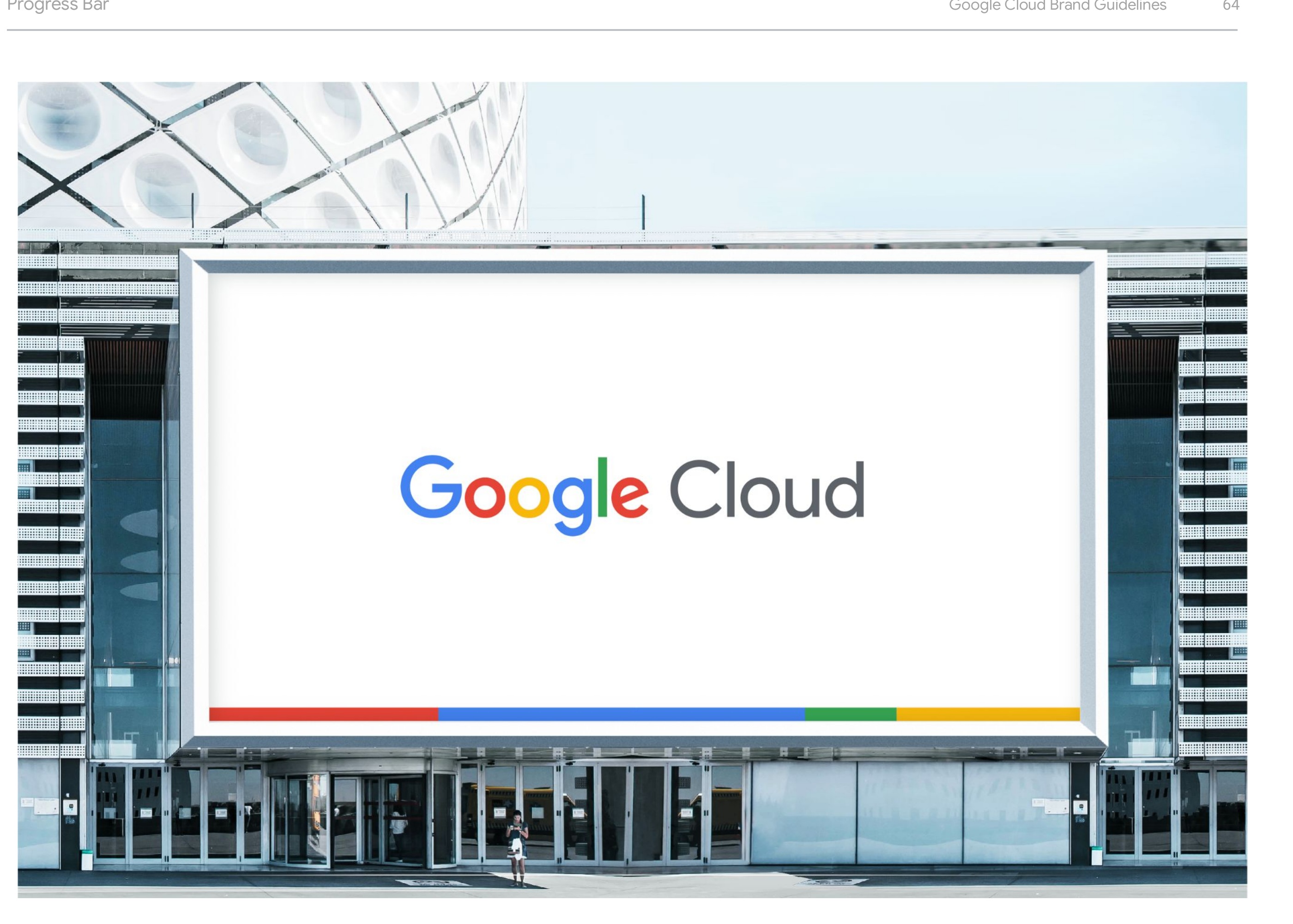
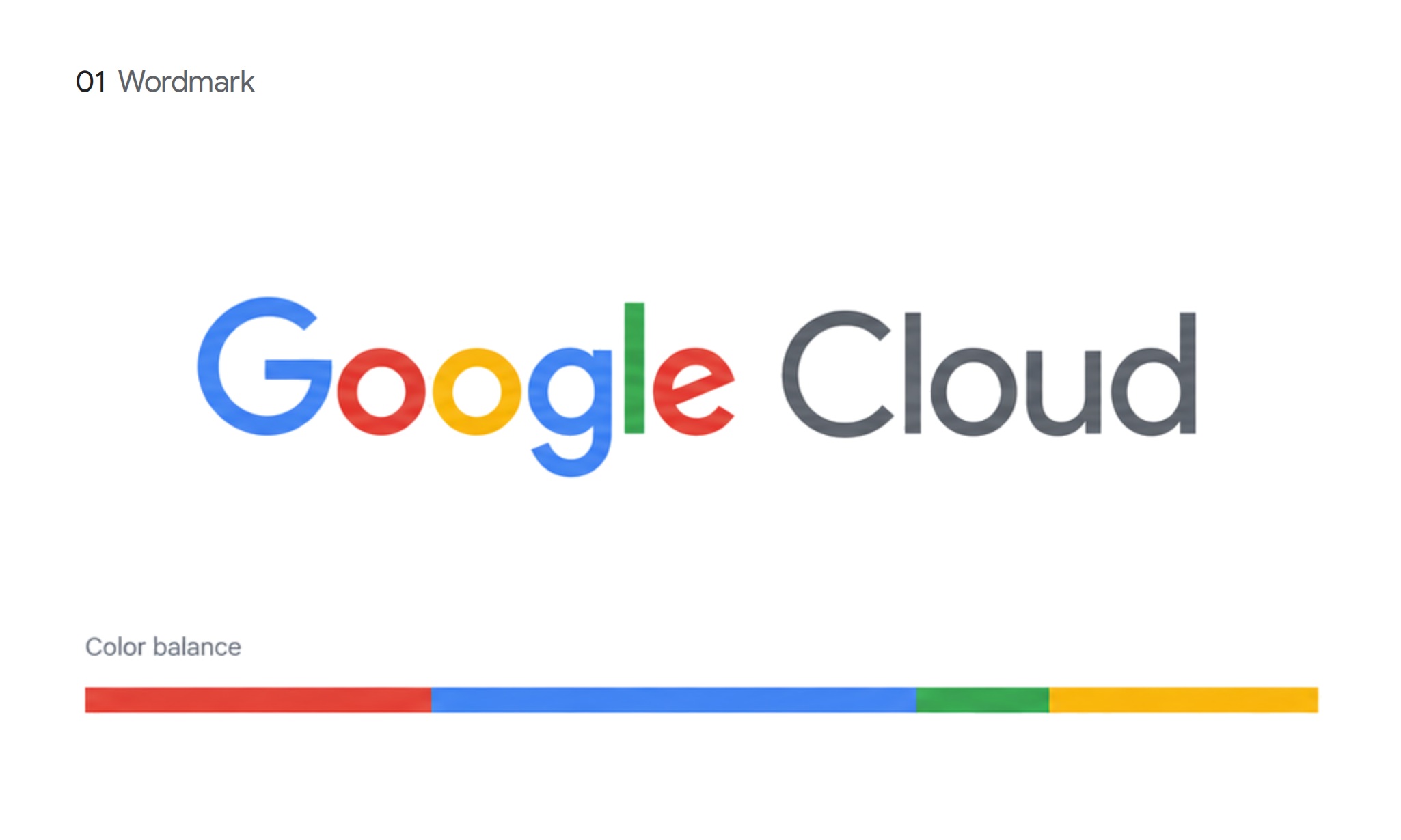
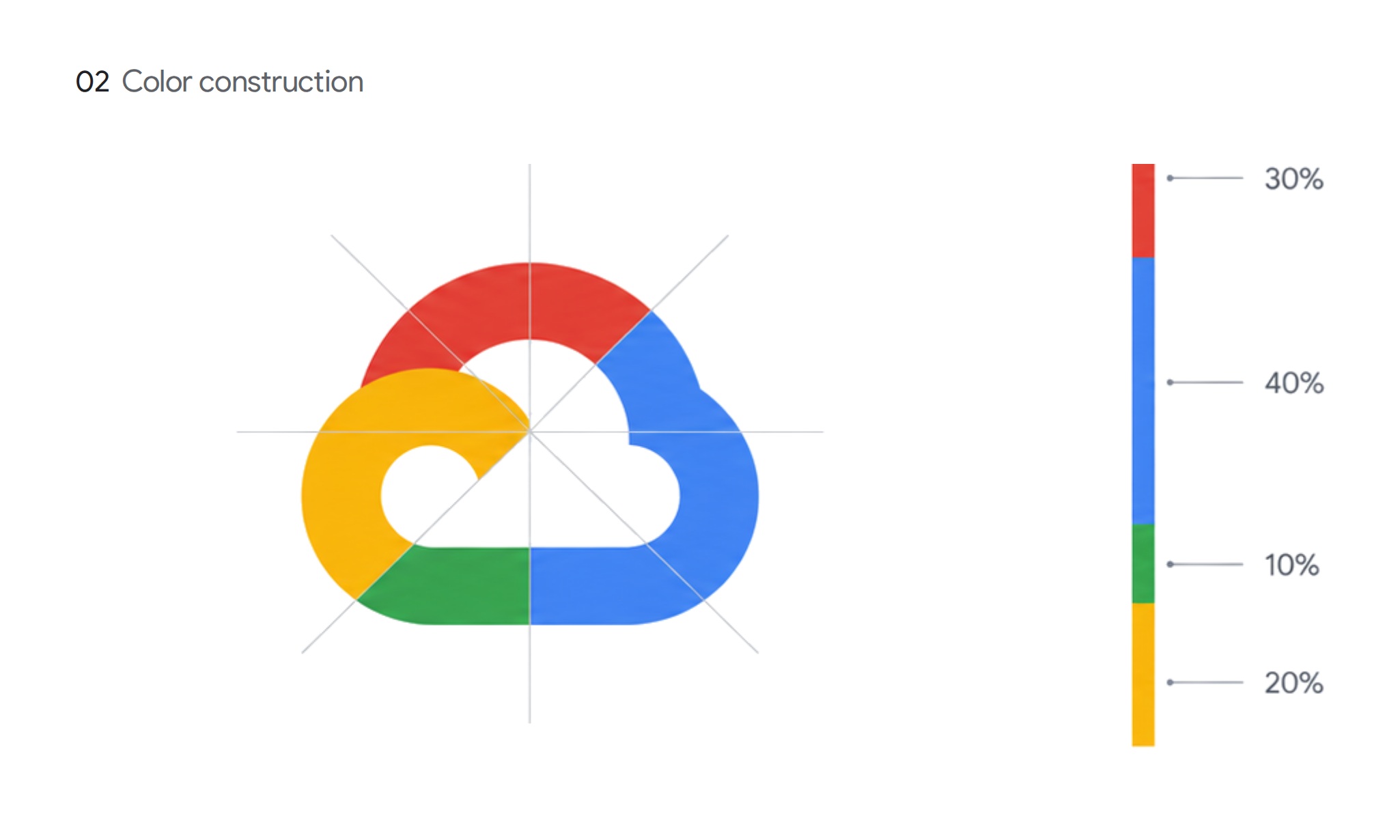
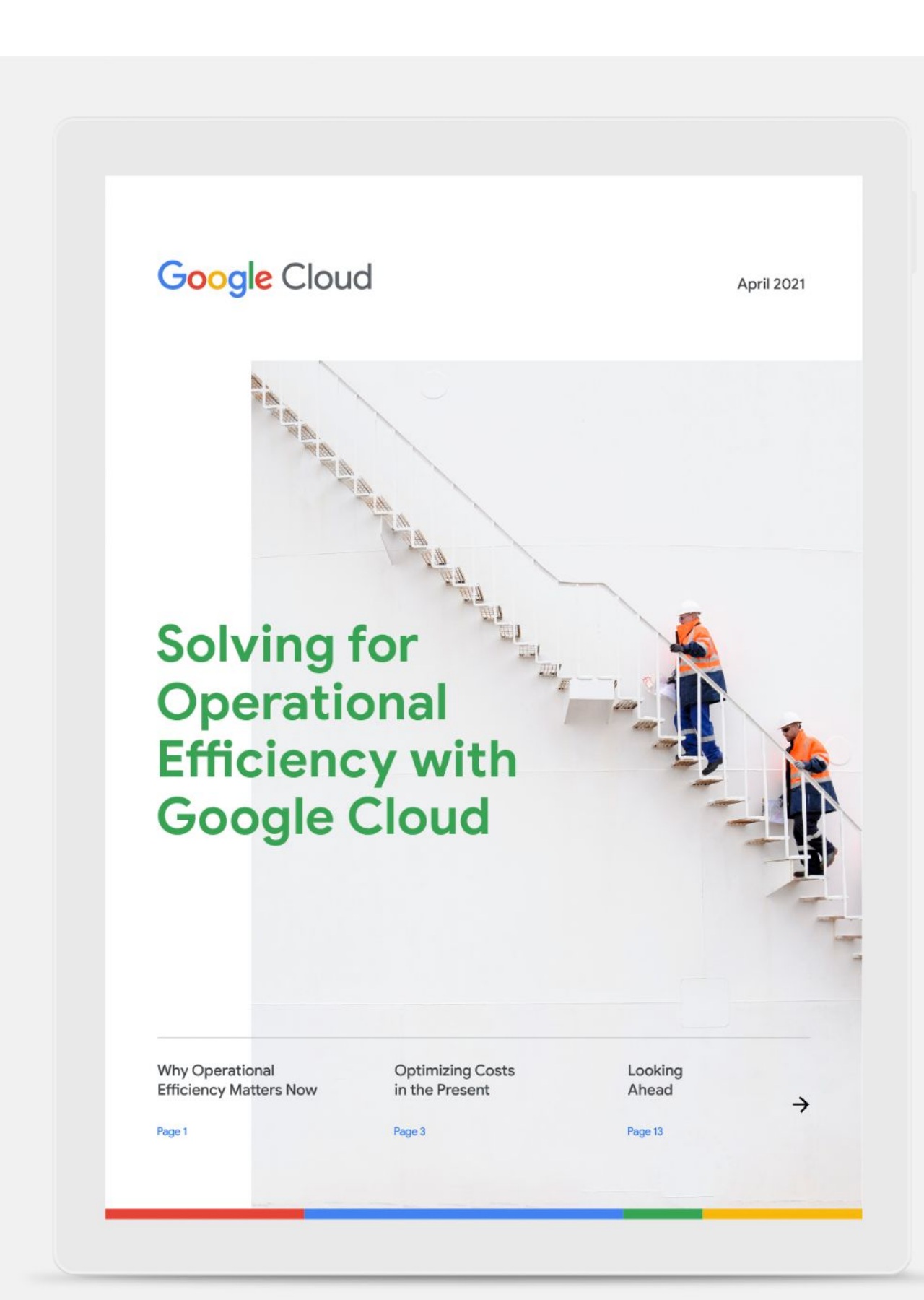
The Super Cloud had become the answer to everything: every layout leaned on the mark, and it was wearing thin. The Progress Bar is the Super Cloud unrolled. Same four colors, same proportions, 30 / 40 / 10 / 20, laid out as a line. It gives the system a second signature that carries the brand without repeating the logo, and the wordmark and the bar are now always paired.
Banners
Color: the blend is the brand platform
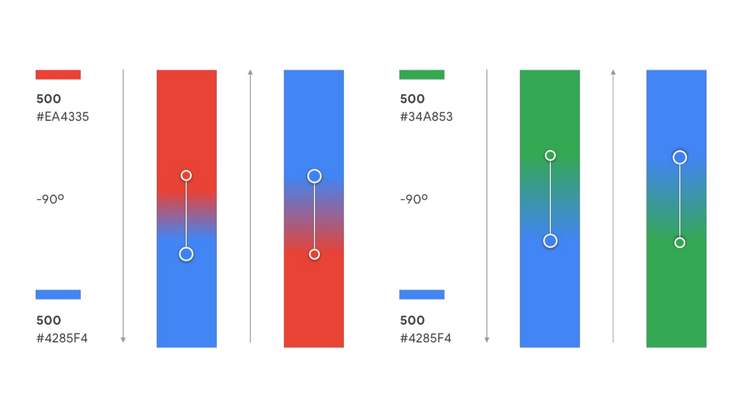
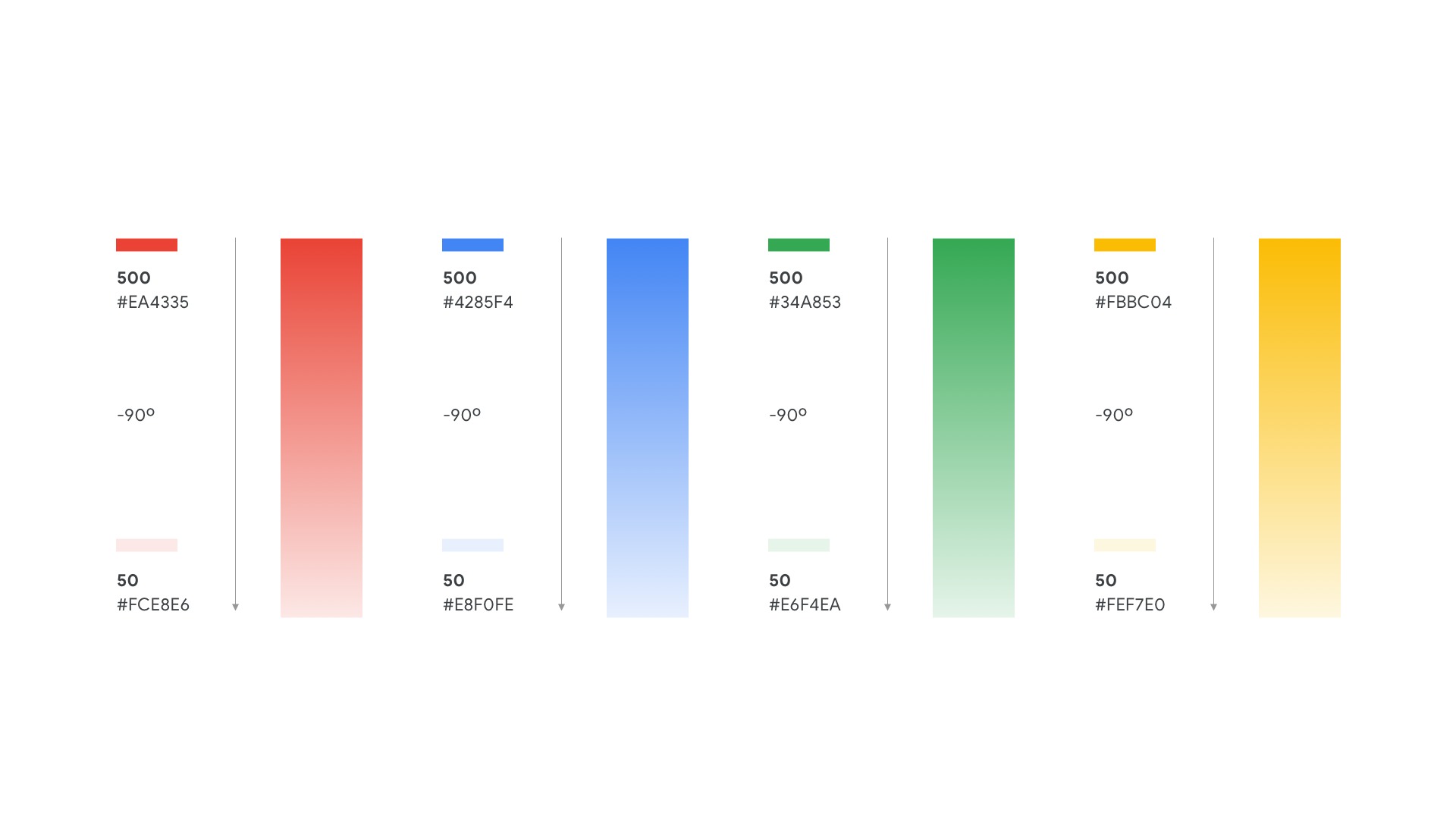
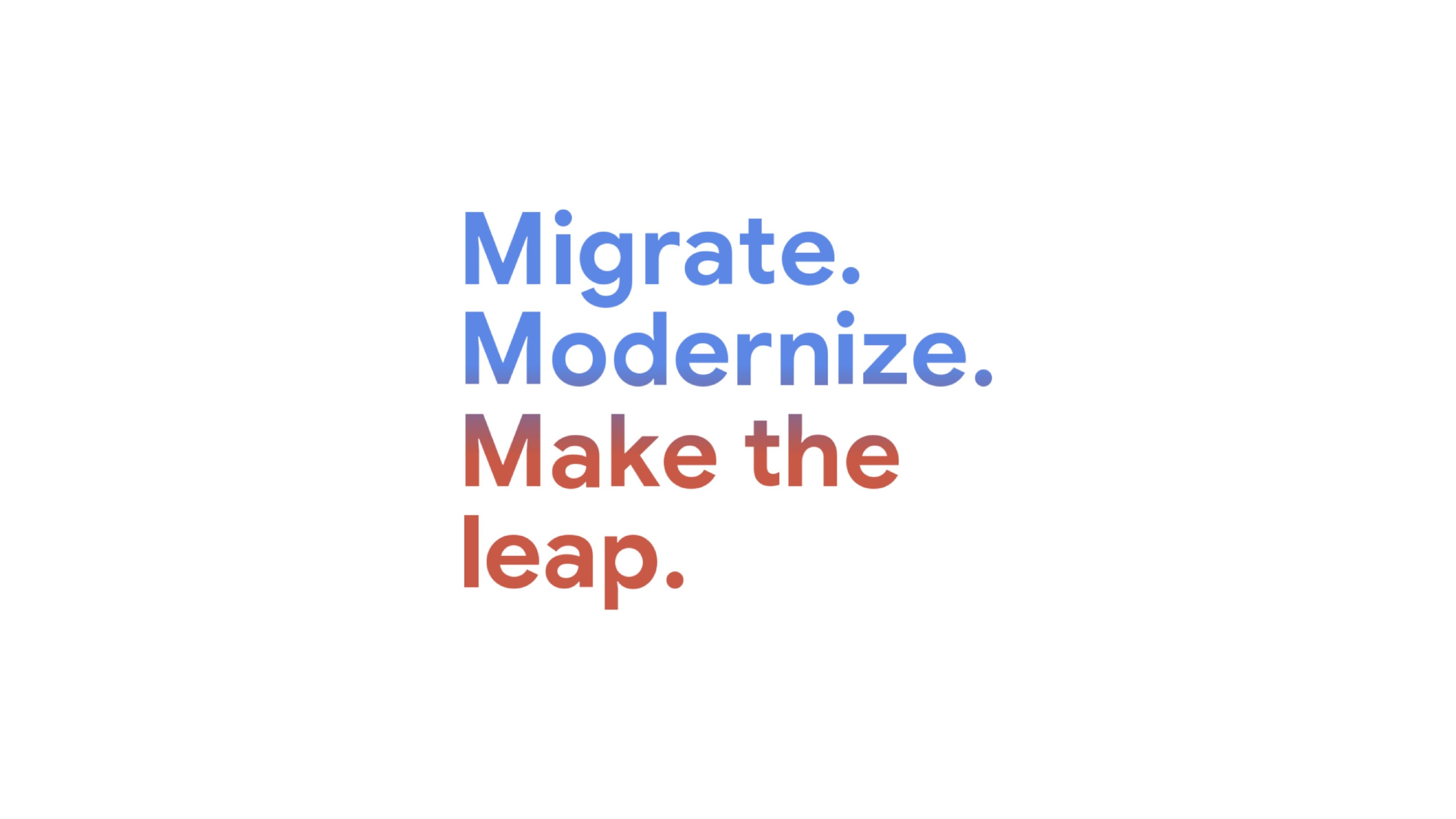
The strategy is Help Accelerate Progress Every Day. The gradient is where that lands in the system. Every blend moves from one state to another: a core color to its lightest tint, one Google color into the next. Nothing in the palette sits still. Progress is built into the color itself, so a poster, a banner or a headline reads as movement from where a business is toward where it could be.
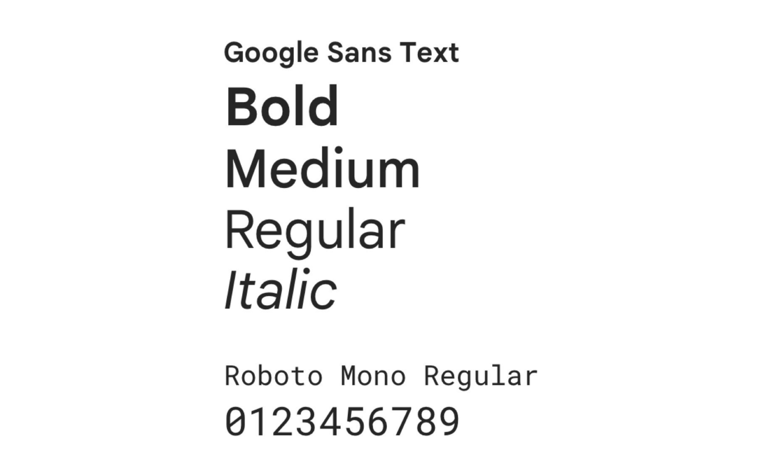
Typography